“The 25-year-old coder was giving suggestions on what typeface to use. The problem — he was also the client.”
Said a renowned London-based designer over lunch, before the pandemic. Some background — he had just concluded a rebranding of a tech giant posting USD900mil revenue that year. Multi-award winner, D&AD black pencil, ex-president of D&AD, DesignWeek Hall-of-Fame, three best-selling books in design and branding. Someone who could write a book on typography in his sleep.
And yet — politely dealing with a client who was giving him instructions on selecting fonts.
“In his world, his knowledge of fonts are Lato, Roboto, Nunito.” Google fonts. A brand that happened to be a direct competitor to the client.
All designers have an equivalent story.
Paula Scher famously doodled the Citi logo in a few seconds. Then spent months getting it approved. “We need to see more options” — familiar in every boardroom.
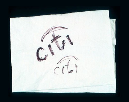
A few seconds? Paula’s answer: “It’s seconds done in 34 years.”
I started my design career in 1994. That’s 28 years of practice — to the extent that certain skills and knowledge have become muscle memory. Most of the time I just know. I don’t think too hard. It takes a few seconds to solve a problem that might have been troubling another designer for a week. “Move that to the right corner.” “Change it to #b6b6b6.” My infamous line that scarred many junior designers: “it’s not aligned properly.”
“But how do you know?”
Explaining to other designers is still possible — there’s a shared language, shared principles. Explaining to people outside the design world is where it gets complicated. Because “move that to the right corner” is derived from 28 years of practice. Unpacking that in a client meeting, in real time, is not a good use of anyone’s afternoon.
The best part of my job is working with clients determined to solve strategic problems. How would the audience process the information? How would they react? How can we give them a better experience? These clients challenge me to rethink my decisions. Intellectually stimulating. Genuinely rewarding.
But occasionally comes a client who loses sight of the end goal and starts inserting themselves as co-creator. It gets messy fast.
“Can you try an option which is justified?” “Move this to the left, show me?” “Can we use a handwriting font here?” “Can we make the lines thinner?”
The reason for all of these requests? It will look nicer. More aesthetic. More elegant. More balanced.
Two choices. Lengthy explanation — why justified text won’t work, why the handwriting font won’t scale, why thinner lines disappear on a mobile screen. Or: keep quiet, produce a second option, and hope the client talks themselves out of it. Sometimes that works. Sometimes it backfires spectacularly. Aesthetics is subjective. It is too easy to fall in love with one’s own idea.
“Don’t you think the justified text looks so much nicer?”
I have clocked more than 57,000 hours in doing what I do. I have learned to choose my battles. Lose the scuffles, win the war. Let the small things slide. After all — there’s no definitive guide to what is nicer.
Kyle Cooper once told me about presenting the Mission Impossible titles. A famous actor — whose name starts with T — refused to approve because his name wasn’t appearing in red. “If the only thing needed is to change his name from blue to red; if T wants it, T gets it.”
The war is won. Let T have red. Don’t let the designer’s ego get in the way of the bigger picture.
Many years ago, I was working on a project involving marketing launches across several countries. Everything was sorted except one. The regional marketing director called to check status.
“Why not that one?”
“Because they still want to change the colour and tweak the layout.”
“Gosh, why did I pay you so much money? Why are my people trying to design? How does it matter whether it’s pink or red?”
She made a call. Within minutes, everything was a go-ahead.
I almost cried.
That’s the client you work for everything. Not the one obsessing over justified text. The one who calls, cuts through it in thirty seconds, and lets you do your job.
Occasionally though — along comes the other kind. The one with non-negotiable feedback and endless options.
That’s when I say: I’m getting too old for this shit.

