Back in 2007, while roaming around in the older parts of Mumbai with the Vignellis, Massimo was observing the chaos of the markets. Within the numerous hand-lettered and hand-painted signages that adorned the shops, occasionally the Vodafones and Docomos and Coca-Colas and modern banks appeared in the mix. Modern international branding clashing with everyday branding. “Visual pollution,” Massimo called it. To him I said, “But Massimo, you’re partially responsible for this pollution.”
With a typical Vignelli mischievous smile, he said, “This is where it gets interesting.”
That was 19 years ago.
What followed was 19 more years of me working as a designer. The work is multi-disciplinary, but the heart is very much a graphic designer. I’m conditioned to think in graphic expressions while maintaining visual consistency. I’ve done my fair share of assembling lines, shapes, forms, type on hierarchy, grid and systems.
I built a solid career out of being a graphic designer.
That’s one side of me.
Then there’s the other side of me that questions — what if I remove “graphic” from graphic design, and just let design be design? Let it be communicative, let it be provocative, let it narrate stories. Anything but graphic.
The theme for Designyatra 2026 “It’s Nice, And…” was written pretty quickly. I knew from the onset I wanted to take the conversation about design toward where design takes action and has an impact — and hence revamped the Kyoorius Design Awards to look beyond craft. For Designyatra, I set my mind on the speakers I wanted to invite, and a list of no-s. Nothing disrespectful — just no to Instagram artists or design philosophers / influencers with no work in the marketplace. “5 tips on how to create great branding” with 100K likes from that charismatic guy won’t cut it if he’s produced nothing for the real world.
Designyatra 2026 started off with the usual explorations of event branding — type in motion, graphic forms, motion expressions, circles, squares and colour bands.
Perhaps I’ve done too much of this — none of the routes excited me.
My mind drifted back to the collection of short stories we wrote for the Kulavoors. In Everyday India, there are many designers to be found. With a pinch of snobbishness, we label their work as vernacular design, to differentiate ‘them’ from us professional designers. But to the people they serve, they are the designers — perhaps held at a higher position than us.
Nice design, after all, is in the eyes of those who commissioned it. Who are we to judge? And when the visuals of an entire area — say, all the shopfront signages of Andheri — are shaped by one or two men, can we argue that their design has no impact?
That was the AHA moment.
It’s nice, and… it works. For that area, for that purpose, for that client.
Fast forward.

We built the entire promotional campaign based on stories from everyday life. The kid who got a new haircut from a local barber. The girl who chose to eat a local pizza. The seller who has a full cart of oranges. The temple bells. The pigeons that flew away. Found a willing partner who went out to capture all these stories on camera.
We then anchored the event “branding” on the work of a collective of local designers. We went looking for them. Some had held onto their profession proudly and were still thriving. Some had given it up and had to be coerced out of semi-retirement. Their competition? The younger guys making signages with flex prints set in Arial. For supporting communications, I chose an unassuming sans serif — Switzer, supplied by Satya Rajpurohit via Fontshare.com. As bland as it could get, so the local designers would shine.

We provided the backstory and contact numbers of all the designers who worked on Designyatra 2026 in the Programme Booklet, hoping they’d be engaged for future work. Ironically, in the same booklet, the speakers — aka stars of today’s visual branding and design world — got a single line: name and company.
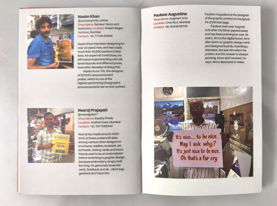
The reaction? Divisive. Some loved it. Some hated it — called it bland, called it a joke, called it not reflective of the status design should have at a legacy event like Designyatra.
It is all quite intriguing.
—
Over dinner, a delegate engaged me in a lengthy discussion about my decisions.
“There are better letterers and hand-painted type artists in the country. What you’ve chosen isn’t the best. And the branding could have been more expressive.”
But that was the point — these people have made an impact on their locality with their design. It worked for their customers. So who are we to judge whether their work is nice or not? I’m merely presenting them as who they are.
“Even so, you should have spoken about this on stage, so people understand your intentions. Because we all judge based on our own sense of aesthetics.”
Which is the trap. Do we really have to be critical about everything we see, just because we’re designers with our own sense of what’s nice?
It’s nice, and… if it works, it’s nice.
Maybe that’s the same trap Massimo saw in Mumbai in 2007 — modern branding announcing itself as progress, but landing as pollution on a landscape that vernacular design had already made work. Nineteen years on, I’m still asking his question back to myself. This is where it gets interesting.
Team credits
Curation & Creative Direction
Kay Khoo & Anusha Narayanan, fish do it
Team: Aditi Elassery, fish do it; Nayanika Chatterjee, Studio Isthisart__;
Umma Saini; Zeeshan J, Anymotion Studios; Rishabh Gandhi, RSquare.


One Comment